top of page


Sproul.club
Role
UX/UI Designer
What is Sproul.club?
Sproul.club is an interactive web application where students can search for clubs, organizations, and communities relevant to their interests at UC Berkeley. As opposed to hassling with various club flyers, students can browse all on-campus organizations through one platform to stay organized. Sproul.club was founded by Berkeley students to provide an easy experience for Berkeley's club searching process.
During the Fall 2022 semester, Sproul.club was a club project for Web Development at Berkeley. Working as an Industry Designer in Web Development at Berkeley, I worked in a team of 2 designers and 8 developers to bring this club's project to life.
Skills
Figma
Timeline
Sept - Dec 2022
The Scope
Although many of the designs were previously established before Fall 2022, the previous designs needed to be reworked to provide more accurate information for Berkeley students. Sproul.club also needed a design refresh, which was done while keeping its established design system.
Problem Statement
Students are unable to see accurate information on the current website, making it outdated and needing a design rework.
Problem Solution
To design an effective layout displaying the necessary information when searching and applying to Berkeley clubs. While having access to club updates online, students will also be able to directly apply to clubs through this browser.
Competitive Analysis
Popular
Unpopular
Icon-based card display
Text-based card display


Design Implications
1. Find an effective way to display information through a digestible design using both icons and text in a card design -- similar to Spotify and Apple Music.
2. Have students apply to clubs within one browser to allow easy organization during the club searching and application process.
3. Implement an organizational way for students to read about each club -- what Berkeleytime and LinkedIn do for each class and job description.
Previously Established Sproul.club Design System


Logo
Typography

Colors

Buttons


Illustrations


Navigation Bar

Low-fidelity Brainstorms
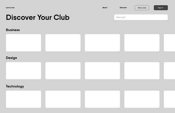
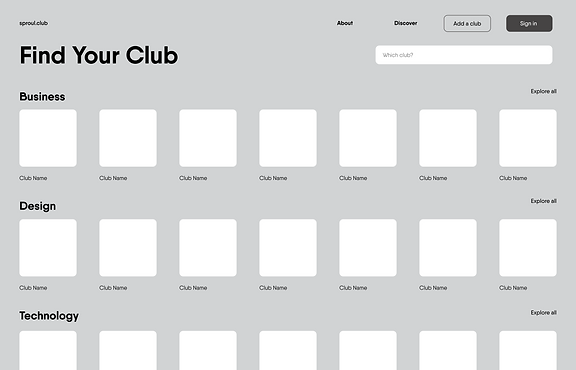
Ideating various ways on how to effectively display club information for the project's needed screens: Landing page, Discover page, Explore All page, and User Dashboard.
Landing Page

- Rectangle card design
- Horizontal scrolling
- Random club selection to be featured on landing page

- Square card design
- Explore all button to view all clubs
- Displayed clubs separated by type
Discover Page

- Rectangle card design
- Horizontal scrolling
- Displayed clubs separated by type with search bar feature

- Square card design
- Explore all button to view all clubs
- Displayed clubs separated by type with search bar feature
Explore All Page

- Rectangle card design
- Verticle scrolling
- Search bar and tag features to filter out clubs when viewing

- Long rectangle card design
- Filters and tags all displayed on left sidebar

- Rectangle card design with selected club displayed on the right
- Horizontal scrolling
- Search bar and tag features to filter out clubs when viewing
- Simultaneous club searching viewing -- similar to LinkedIn
Dashboard Page

- Rectangle card design
- Verticle scrolling
- Applied and saved clubs complied into one area
Mid-fidelity Ideations
Implementing the established design system into the UI design. This was also the stage where designers were informed to create a Sign-in and Events Page. Various screens were also compiled into one because of their similar features, allowing users to navigate easier through these screens.
Landing Page

- Rectangle card design
- Concluded Explore all button was best for a more organized layout -- similar to Spotify
- Displayed clubs separated by type
- Addition of Events button on navigation bar and Events announcement banner

- Square card design
- Explore all button to view all clubs
- Displayed clubs separated by type
- Addition of Events button on navigation bar and Events announcement banner
Club View Page

- Verticle scrolling through clubs with display of selected club on the right
- Search bar and tags filter feature -- similar layout and features of LinkedIn
- Simple club apply process through a button within each club description
Events Page

- Random featuring of club types as buttons on the top of the screen
- Verticle scrolling through club events with display of selected event on the right
- Search bar and tags filter feature -- similar layout and features of LinkedIn
Sign-in Page

- Simple sign-in design
- Students can create personal accounts with school emails to save clubs and their applications
Dashboard Page

- Rectangle card design
- Verticle scrolling
- Display clubs separated by different saved purposes after creating an account
Usability Testing
To gain more insight into what Berkeley students need when searching for clubs, our usability testing was done among Berkeley students of varying grades with the Mid-Fi Designs. It was also concluded that the rectangle card design best-displayed club information, especially on the Landing Page.
Landing Page

- Make more specific to a certain club event.
- Club recruitment? Club infosessions? What does this mean?
- A lot of clubs do internal events. Is this a club fair?
- Topic is broad. What does it mean?
- Will this be random everytime after refreshing?
- Would rather see topic of club instead of open/closed apps
- One line description? Limit to 10 characters?
- Waste of card space on Landing Page if club applications are already closed.
Club View Page

- Label the button "App Required." Could cause confusion.
- Clickable links, if it isn't already.
Events Page

- Make categories more customized. "Top pics, Recommended for you."
- Save and Add to calendar sound the same.
Dashboard Page

- Categorized by applications submitted and those still
in progress?
- Show status on application process on card.
- Will I see my saved events?
High-fidelity Designs
After receiving feedback during the usability testing stage, the Mid-Fi Designs were revised into our Hi-Fi Designs.
Landing Page
Club View Page


- Rectangle card design
- Making the horizontal scroll from the Dashboard Page consistent among screens
- Displayed clubs separated by type
- If club's recruitment is closed, club's card is removed on Landing and Discover Page
- Short club description displayed on each card
- Verticle scrolling through clubs with display of selected club on the right
- Search bar and tags filter feature -- similar layout and features of LinkedIn ("App" drop-down menu changed to "App required" label for clarity)
- Simple club application process through a button within each club description
Events Page

- Verticle scrolling through clubs with display of selected club on the right
- Search bar and tags filter feature -- similar layout and features of LinkedIn
- Simple club application process through a button within each club description
- Heart icon added next to Add to calendar button, replacing the Save button
Sign-in Page

- Simple sign-in design
- Students can create personal accounts with school emails to save clubs and their applications through personal dashboards
Dashboard Page

- Rectangle card design
- Horizontal scrolling -- same scrolling design as Landing/Discover Page
- Display clubs separated by different saved purposes after creating an account
- Students can view each club application and its details
High-fidelity Designs Walkthrough
Video of user interacting with the High-Fidelity designs.
Concluding Thoughts
1. While there are still ways to go in developing this website for its intended use, it was insightful to oversee what Berkeley students see as crucial when applying/exploring on-campus clubs.
2. Developing an effective card design was more challenging than I thought. However, the final card design does enable students to browse clubs while digesting important information efficiently (Viewing the low-fi to hi-fi card designs, many design ideations and information were taken into account to conclude the best informative visual for these cards).
3. If more time were allocated, I would explore different ways to display the varying types of clubs on the Landing Page. Since numerous clubs serve countless purposes and experiences, I would try to find a better design solution that would allow a more organized design system to display Berkeley clubs.
4. It would also be useful to design a mobile design for this site. Knowing college students are always on the go, an app or mobile design would help adapt this online club browsing to college students' lives.
bottom of page